{{template-name}} Template
What is a {{template-name}}, and when should you use one?
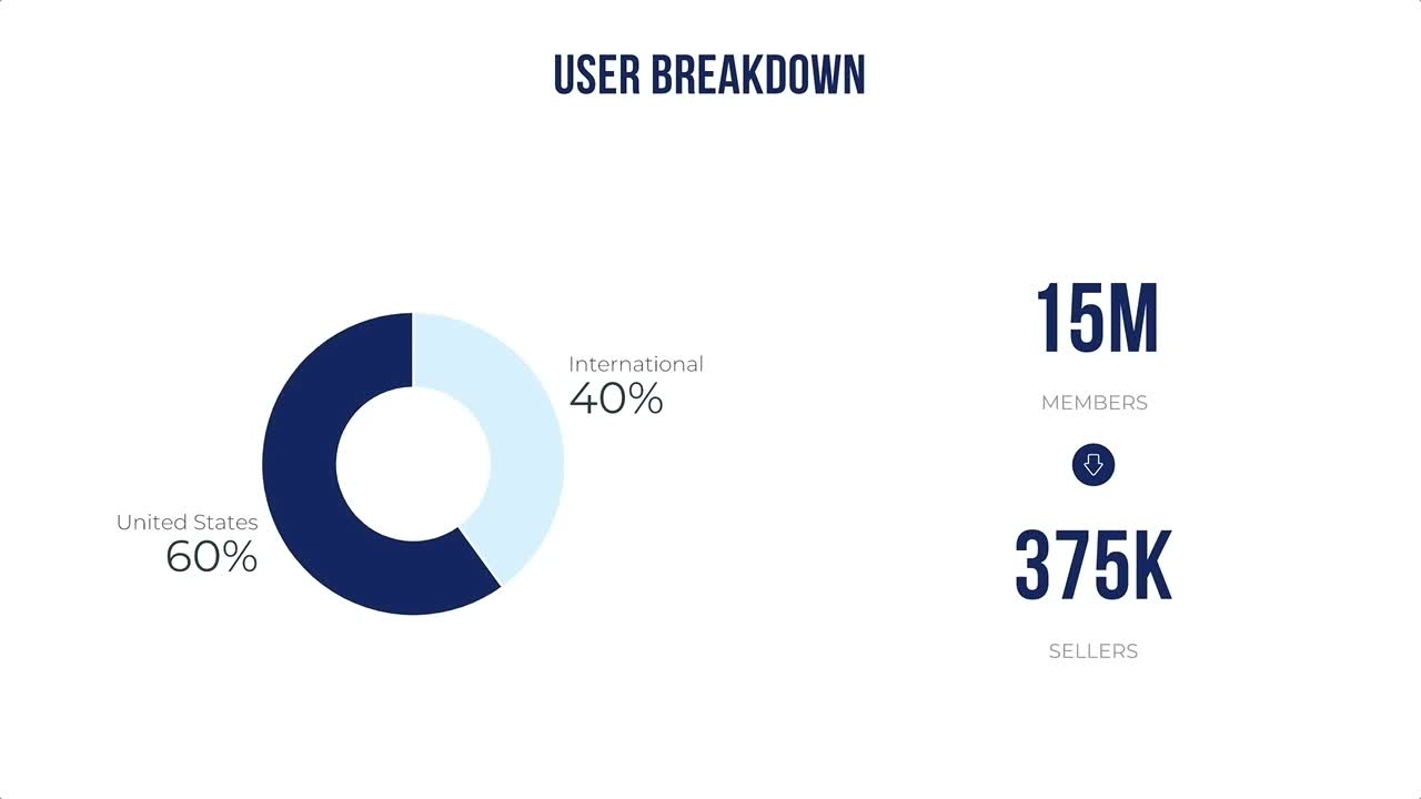
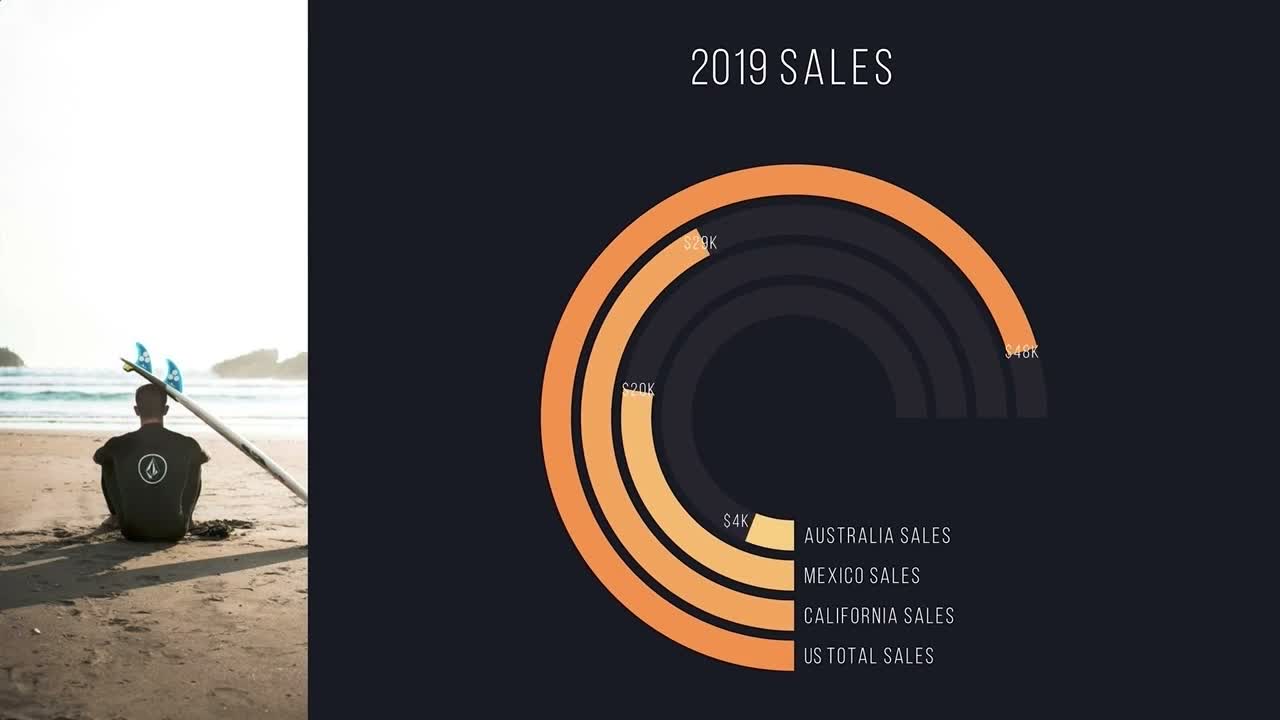
You may notice that a donut chart looks like another popular type of diagram where each of its slices represents a proportional relationship of parts to a whole: a pie chart. While a donut chart is essentially the same as a pie chart in function, with its center cut out, the “slices” in a donut chart are sometimes more clearly defined than in a pie chart.
Instead of comparing the different slices in a pie chart, the viewer focuses on the percentages of each piece in a donut chart. Plus, the blank center of a donut chart can be used to display even more relevant information inside.
Use a donut chart template to:
- Display parts of a whole
- Show percentages of different categories
- Weigh proportions
Pro Tips for Donut Chart Template
When using a donut chart template, keep these tips in mind.


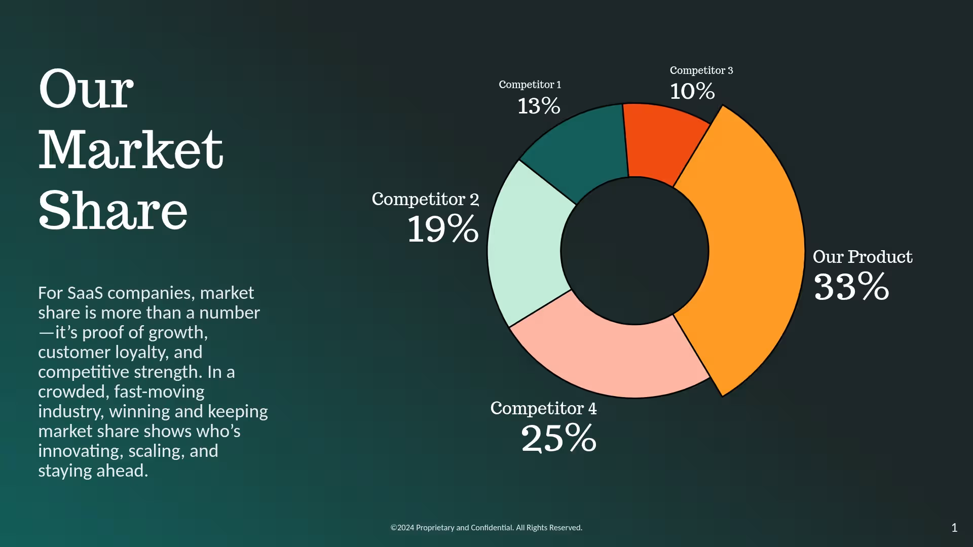
Make the information as clear as possible to readers at first glance. Label each donut piece with the right percentage and information.
Use the blank center in your donut chart template for extra information, like the title of your diagram or the total number of what you’re measuring.
You have a lot of room to play with color with a donut chart. Make each piece a unique color, fill, or pattern to show the differences between them.
Remember that donut charts display the percentages of a whole that add up to 100%. Check that your math is right before your presentation is finished!
Browse more templates

More {{template-category}} templates


AI-powered Smart Slides that do the design for you
Build your next presentation using Smart Slides—the intelligent building blocks behind every Beautiful.ai presentation. Each Smart Slide is customizable, editable with AI, and automatically adapts layout and spacing as your content changes.

“Beautiful.ai helps us quickly create clear and compelling presentations to share our strategy and results. It has been easy to integrate our branding and to pull from the library of materials created by others — building a cohesive and collaborative suite that helps us advance our mission."

"Beautiful.ai increased our efficiency. I mean, 50% sounds crazy, but it's pretty accurate when you consider all of the manual stuff that we used to have to do that Beautiful.ai now does for us."

"What you guys have created is a foolproof way to ensure quality presentations. It's almost just like they have a graphic designer over their shoulder while they're creating their decks."

“For any business owner or entrepreneur where time is of the essence you lose the ability to put those nice touches on presentations, Beautiful.ai does it for you, especially if you aren't creatively gifted!”
Ready-to-use presentation templates for creating full, polished decks.



Pitch Decks



Reports & Reviews


Plans & Strategies
Try it free for 14 days
Start building Beautiful presentations.

