WeWork co-founders Adam Neumann's and Miguel McKelvey's business collaboration very well could have been destined long before the coworking company’s 2010 startup. The pair share rare yet similar childhood experiences that provided each man with a unique understanding of sharing space in a productive way.
While McKelvey grew up in an Israelian communal farming community known as a kibbutz, Neumann hails from a commune in Oregon. The collective living styles to which both were accustomed provided the perfect model for the collaborative coworking environment that evolved into WeWork.
Of course, when they decided to transform one floor of a New York warehouse into an eco-friendly coworking space in 2008, neither man could have imagined eight short years later they would be filing paperwork to go public with a company, now legally branded as the We Company, potentially worth $20 billion.
Customize this pitch deck template now
Why WeWork is Different
WeWork isn’t just another New York office incubator, though. While the market already featured various contenders selling shared office space, WeWork stood apart by leasing collaborative working environments where entrepreneurs from different walks of life could engage with each other in office environments that rank up there with some of Silicon Valley’s most famed workplaces.
"It seemed so obvious to us," McKelvey told Forbes. "What was out there for office space was not good – it sucked."
WeWork’s coworking spaces aren’t just open floorplans that encourage collaboration. They also feature networking opportunities like weekly bagel-and-mimosa events and happy hours where members can network as they discuss ideas and offer advice.
"All the resources are here," Neumann told the New York Daily News in 2015. "Yes, we have conference rooms and copy machines, but we also have ways for people to know each other. At Midtown, we have a keg that flows all the time. We have started to put like-minded businesses on specific floors. We have a music floor Midtown,and we'll have a fashion floor with maybe seamstresses in Meatpacking. In SoHo, so we set up an incubator where we encourage working together. We're opening up a cafe there. We have a lounge; people pay $275 to use the space anytime. We do whatever we can to help community."

A New Office Concept Catches On
WeWork locations are particularly popular among Millennial-aged entrepreneurs in part due to their eco-friendliness and tech advancements. The company’s New York headquarters, for example, features a touchscreen that allows WeWork employees to view real-time data on its coworking spaces – everything from when the air filters were changed to which conference rooms are occupied at any given moment.
“During the economic crises, there are these empty buildings and these people freelancing or starting companies,” Neumann told the Daily News. “I knew there was a way to match the two. What separates us, though, is community.”
Neumann and McKelvey originally established an eco-friendly coworking space in Brooklyn known as GreenDesk. They sold that startup and used the capital to finance WeWork’s first location in 2010 in New York’s SoHo district. Manhattan real-estate developer Joel Schreiber invested $15 million in the new company for a 33-percent stake in the business.
The WeWork concept caught on quickly among young entrepreneurs, and by 2014, Forbes was calling WeWork, “the fastest-growing lessee of new office space in New York.”
At that time, WeWork had opened 20 collaborative workspaces in seven cities and boasted 15,000 members. The growth was in large part thanks to various infusions of venture capital, but business was about to explode.
In late 2014, the company raised $355 million in venture funding from investors including Goldman Sachs, Wellington Management and JP Morgan Chase. WeWork boasted 55 locations by 2015, a number that doubled in 2016 before reaching 178 locations – 10 million square feet of office space – in 56 cities across 18 countries in 2017.
The Original WeWork Pitch Deck
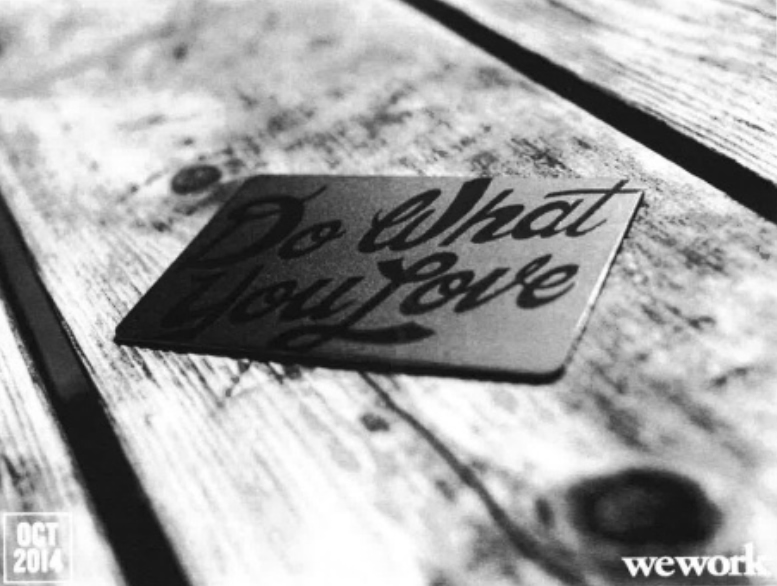
Of course, to impress such prolific investors, WeWork needed a standout presentation describing the company and its business model. And while its 2014 slideshow was plenty informative and almost aggressively thorough, the presentation design left room for improvement.
The problem is many of the slides in WeWork’s 2014 presentation contained altogether too much data for audiences to absorb in a single viewing, while others featured redundant information.
The pitch deck also lacked focus, branching off into descriptions of other divisions within the WeWork brand – important information but too varied for a cohesive slideshow. If you only have a few minutes to grab potential investors’ attention, you’d better focus on the meat and potatoes they need to know you’re a worthwhile investment.
Could WeWork have raised even more venture capital in 2014 if it had a professionally-designed pitch deck detailing its business plan? We’ll let you make up your own mind.
We’ve redesigned the original WeWork pitch deck using Beautiful.ai’s PowerPoint alternative presentation software. Our revised pitch deck template incorporates best design practices recommended by the pros with a variety of customizable themes and presentation templates for practically any purpose. Plus, Beautiful.ai’s presentation design software features a library of vivid, public-domain images, fonts, logos and attention-grabbing animations.
Not only did we expand the number of slides used to present important infographics, but we improved the focus of the overall presentation by eliminating redundant slides and those that aren’t specific to the primary WeWork brand. We also set up a common theme and color schemes for the full pitch deck, so all slide designs automatically share common fonts, colors and page design.
Is it the perfect pitch deck? How do you think we did?
#1. Title Page
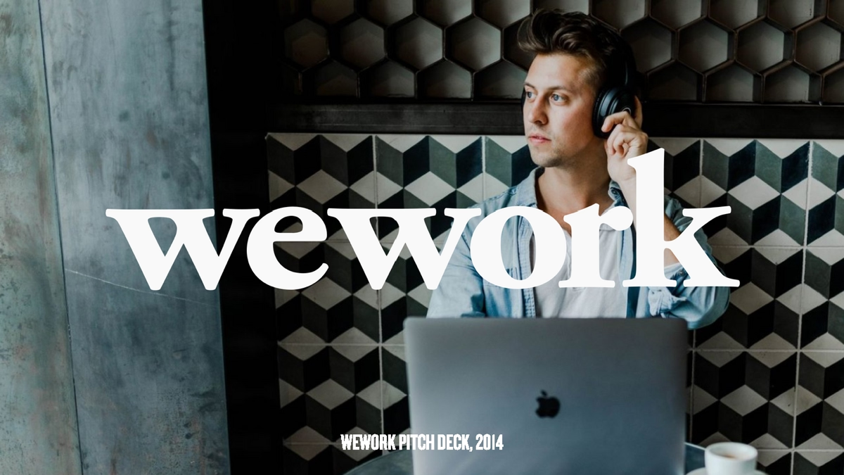
We always think of a pitch deck’s title page like the cover of a book. It sets the tone for everything that comes next. There’s nothing wrong with WeWork’s original title page, but it doesn’t tell much about the following pitch, either.
We enlarged the brand so the first thing audiences see is the WeWork label. We also replaced the image with one that relates more closely to the company.
#2. Introducing WeWork
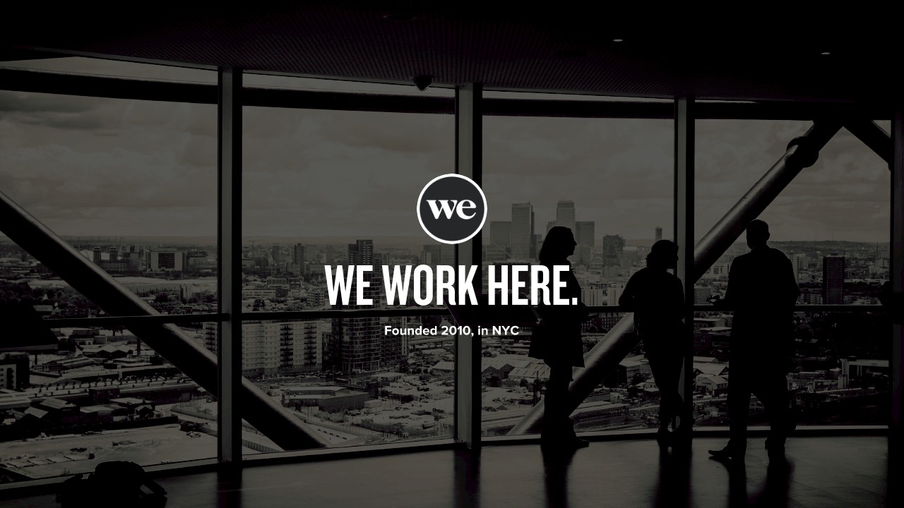
The second slide of WeWork’s original pitch deck served up a heavy dose of data–too heavy for an initial presentation. We inserted an additional introductory slide, so the presenter can take the time to put those public-speaking skills to use and grab potential investors’ attention with more colorful descriptions of the company and its offerings–or even a short relatable story about WeWork’s humble beginnings.
#3. The Numbers
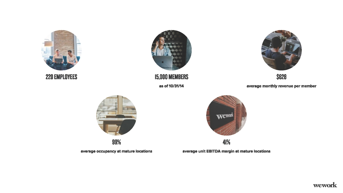
By our third slide, we’re ready to start highlighting some data – but not shove so much down their throats that all those numbers blur into a cloud of indiscernible digits. In fact, we took the infographics from WeWork’s original second slide alone and presented them across four slides designed using Beautiful.ai’s customizable smart templates.
On slide No. 3, we present the company by the numbers, and list key metrics such as monthly revenue and occupancy rates with images from our library that help to tell the company’s story.
#4. Financials
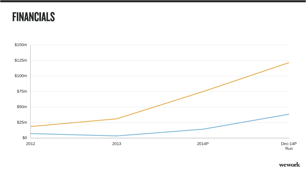
We took the financial data listed in WeWork’s original company overview and applied it to one of Beautiful.ai’s smart templates, creating an animated line graph that compares annual revenue and EVITDA. Not only is the data presented in a more digestible serving, but the animation helps tell the company’s financial story.
#5. Growth
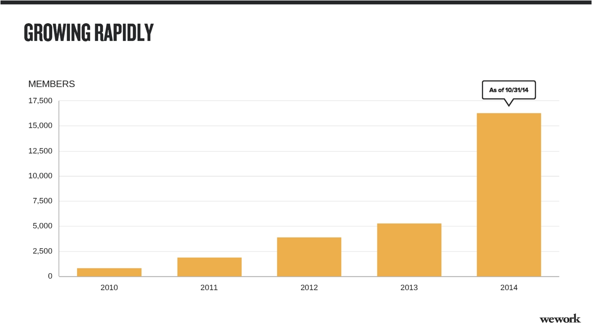
Our fifth slide continues to present infographics from WeWork’s original data-filled second slide. We customized another of Beautiful.ai’s smart templates to design an animated bar graph that illustrates the company’s growth from 2010 to the time of the 2014 presentation.
#6. Key Markets
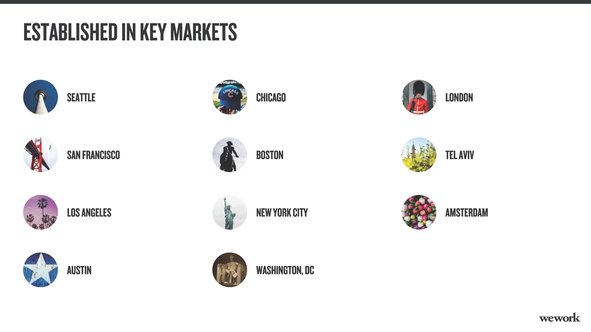
Using Beautiful.ai’s presentation software, we wrapped up our expansion of WeWork’s original second slide with our animated list of the key markets where the company was established in 2014. Our free image library is simple to search, and we quickly and easily were able to find images corresponding with each city to feature in icons that continue and add to our visual story.
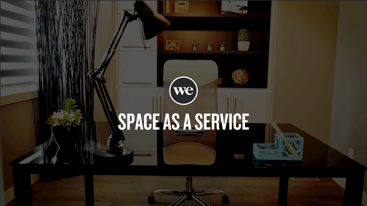
#7. The Product
Now that we hopefully have impressed potential investors with WeWork’s story by the numbers, it’s time to really dig into a description of the product–space as a service. But in the original 2014 pitch deck, WeWork again bombards its audience with too many details for a single slide. In fact, the original was a bland, gray sea of text–not visually-appealing in the least.
In our redesign, we give the presenter another opportunity to dazzle audiences with stellar public speaking finesse. Our slide is a basic title, complete with the WeWork logo on top of an image of the product, office space. All of that textual content can be offered to potential investors via a printed addendum to the pitch or an electronic document rather than a boring slide.
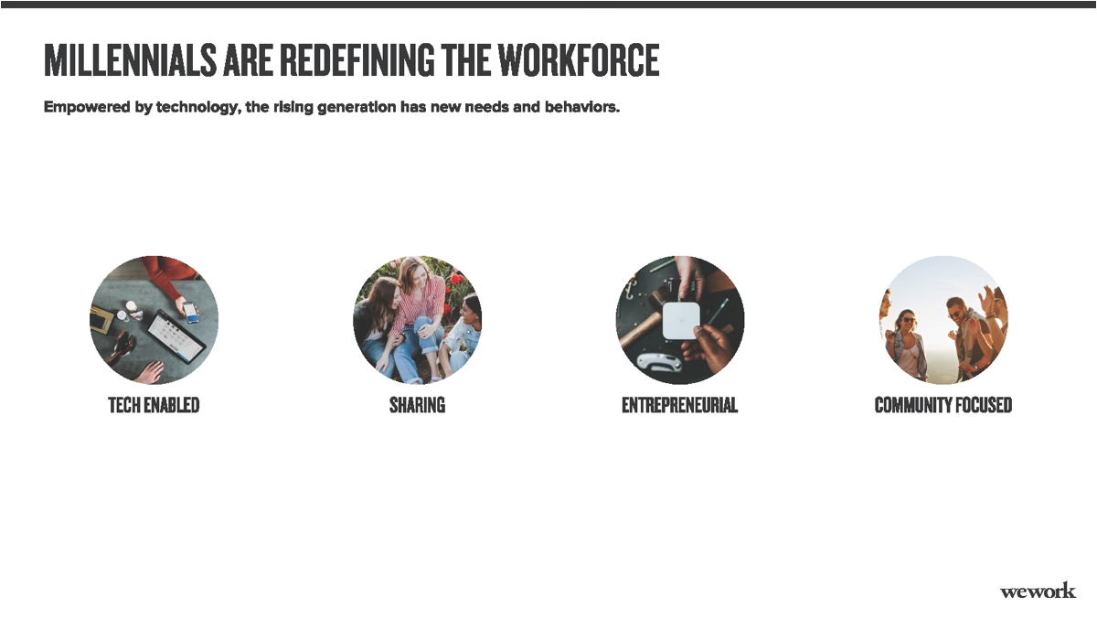
#8. Target Customers
Any effective business pitch deck must provide details about the brand’s target customer. WeWork’s original 2014 pitch deck does a decent job of introducing the target market – millennials in the workforce – and sharing some of their commonalities that draw them to WeWork. While we didn’t necessarily change much, we quickly and easily were able to recreate the slide using Beautiful.ai’s customizable templates and images from our stock library.
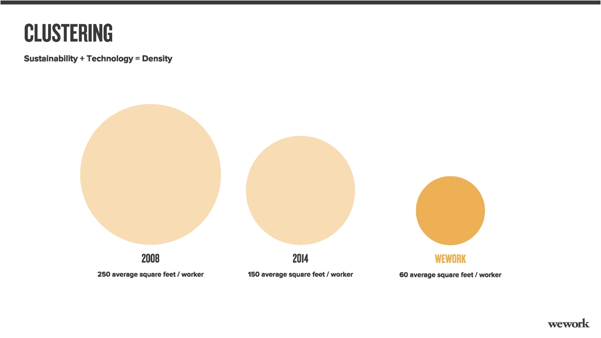
#9. Clustering
WeWork’s next original slide once again presents far too much information for a single slide. Instead, we focused our ninth slide on the clustering potential of WeWork’s collaborative coworking spaces. We chose an animated smart template that demonstrates the company’s efficient use of space using proportionately-sized circles.
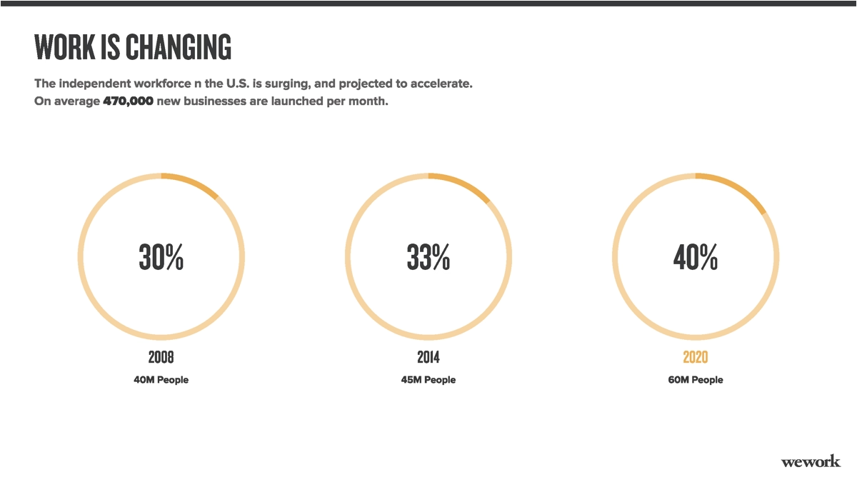
#10. The Potential
WeWork’s original pitch deck illustrated the changing independent workforce using bold numerals, but we redesigned the slide using another animated smart template – this one featuring radial bars indicating growth in potential market size.
#11. The Advantages
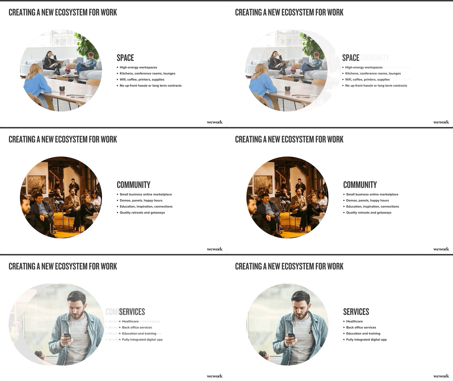
Potential investors want to know what will draw customers to a brand, and we’ve presented those advantages – all tied to “creating a new ecosystem for work,” on our 11th slide. Beautiful.ai’s "Carousel" smart slide template describes one aspect of the workplace ecosystem per slide with a colorful, corresponding image.
This smart slide template also leaves the same header on the top of each slide—so it's easily understood that each point corresponds to the same topic. Seamless transitions between subslides in the carousel template help tell the visual story.
#12. Our Team
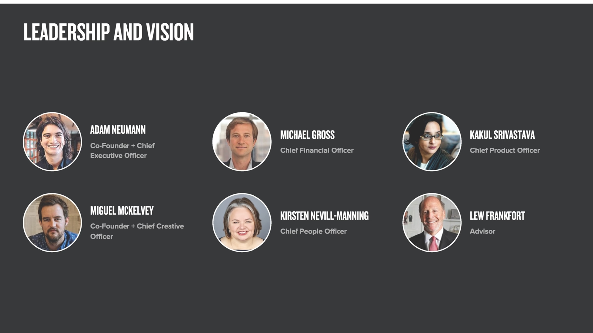
One slide the WeWork pitch deck presentation completely omitted introduces its team to potential investors. We’ve added a hypothetical “Meet the Team,” slide using a Beautiful.ai smart template created solely to highlight team members with headshots, names, titles and descriptions. In our redesign, we’ve just chosen random headshots from our stock image library, but you easily can download your own team images for your custom presentation using our PowerPoint alternative.
#13. Company Information
Our final slide is another omitted in WeWork’s original slide deck: contact information. Every good investor pitch deck should include these vital details, including the company’s primary address, phone number, links to social media profiles, email address and even a Google Maps thumbnail of its location.
We used Beautiful.ai’s customizable slide templates and listed WeWork’s contact details at the end, and we jazzed it up with a grid of applicable images from our free stock image library layered beneath a branded headline.

In Summary
You can see from WeWork’s original pitch deck that the slideshow continues much further, but we’ve elected to keep our redesigned pitch short, sweet and to the point. Sure, there is a lot of valuable data presented across another couple dozen slides, but it’s too much for audiences to digest in a slideshow presentation format.
Instead, take the nitty-gritty details and include them in a printed addendum that you provide to potential investors or in an attached electronic document. They can follow along as you present the highlights or they can reference it later as they consider your proposal.
How do you think we did in our presentation redesign? Our startup pitch deck is definitely more clear and concise without all those redundant slides and data-crammed pages, plus we snazzed up the pitch presentation with attractive images and infographics.
If you like the result, you can customize the presentation with your own information using this high-quality pitch deck template, or start a new one from scratch using our multitude of smart templates that help presenters of all skill levels create slideshows as if they hired a professional designer.
