


Storytelling— a method as old as time— helps connect people and ideas. It takes an ideology, or piece of information, and humanizes it so that the audience can better relate to the information. In fact, research has shown that in MRI scans various areas of the brain light up when someone is listening to a story. It’s no wonder then that storytelling is wildly popular in nearly every culture.
Storytelling can be traced back to the cavemen days when they would use carvings or paintings to narrate stories and ideas. While we've evolved immensely since those days, the origins of storytelling remain the same. However, now storytelling is not limited to books and drawings, and comes in many different shapes and forms. One of those being data storytelling, a method that has become increasingly popular among businesses in the last several years.
Data storytelling is exactly how it sounds: painting a larger picture with your data to make otherwise complex metrics and figures easier to comprehend. Data needs to be put into context in order for non-analytical people to understand it. A big component of data storytelling is utilizing proper charts and graphs to help visualize what you’re trying to say. Data visualization breaks down your information into digestible, bite-size chunks and tells your audience exactly what you want them to take away from the story.
At Beautiful.ai, we have our thumb on the pulse of data visualization. We understand that your data has a story to tell, and our Smart Slide templates allow you to do that regardless of your design background. With a slew of customizable charts and graphs, it’s easy to structure your data in a way that supports your overarching story. Of course, it’s important to understand when to use a line chart and when to use a bar graph, otherwise your figures might get lost in translation.
To help you choose the right chart for your data, we’re sharing 7 examples of how you can use our bar graph to tell your story.
7 Examples of how bar graphs help tell a story
Share wins
You can talk about your success until you’re blue in the face, but eventually you’ll want to put your money where your mouth is and show your success. A bar graph is a great way to illustrate team or company wins. With a bar graph visual, you can easily see your team’s milestones and the upward trajectory, making the wins more obvious to other departments or external partners.
Call out missed opportunities or gaps
Just as a bar graph can help demonstrate wins, it can also be used to call out missed opportunities or gaps. If you’re noticing a downward trend, you can use a bar graph to add context to the declining numbers and point out the opportunities for improvement in your team’s strategy. By acknowledging the gaps and getting in front of the numbers, you can help soften the blow and spin it into a positive for the sake of your story.
Show similarities and differences
You can use one bar graph template slide to display a lot of information— such as similarities and differences between demographics, traffic, campaigns, or sales— but it’s important you differentiate between data sets. When showing similarities or differences between groups use colors, spacing, and labels to make the distinctions obvious.
Track industry trends
A bar graph is a fan favorite for industry trends. The bars allow you to draw a connective line up, down, or steadily across, and help paint the picture of trends that might have been overlooked otherwise. Similarly, you might opt for a bar graph to share a competitive analysis with team members.
Help make less obvious connections
Using a bar graph is a good way to point out patterns or relationships between groups of data. By displaying the data in a more digestible format— through data visualization— the connections between different groups, ages, businesses, or clients can be more obvious to someone quickly skimming your slides.
Demonstrate changes over time
Vertical bar graphs are great for comparing different groups that change over a long period of time. While small or short-term changes may not be as obvious in bar graph form, bar graphs can show growth (or declines) month-over-month or year-over-year. It helps package changes in a more visually appealing way.
Set goals for your team
While this may not be the most popular use case, bar graphs are a good asset to use for setting team goals. You can keep track of sales or traffic throughout the quarter, and use those metrics to see how you’ll trend in each coming month. With that in mind, you can form objectives and key results (OKRs) and track it as campaigns and projects progress.
Examples of bar graphs to transform your data storytelling
Whether you are a manager looking to improve data presentations or an entrepreneur crafting a compelling pitch deck, understanding how to leverage bar graphs can transform your narrative. Now that you have examples on how to use bar graphs to tell a story, discover how you can make your data not just informative but truly compelling with examples of bar graphs.
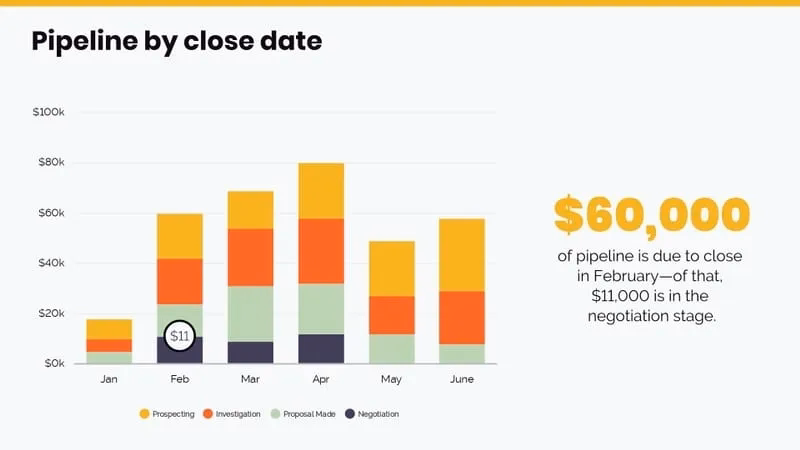
Sales performance analysis
A bar graph is an invaluable tool for conducting a sales performance analysis. By plotting sales data over different time periods, such as months or quarters, you can easily identify trends and patterns. For instance, a bar graph can show which months had the highest sales and which ones lagged behind, allowing you to pinpoint seasonal trends or the impact of marketing campaigns. This visual representation makes it straightforward to compare data across different periods, helping you make informed decisions about resource allocation and strategy adjustments.
Market trend comparisons
Market trend comparisons are essential for understanding the competitive landscape, and bar graphs are ideal for this type of analysis. By using bar graphs, you can easily compare different market trends side by side. For example, you can plot the market share of various companies over the past five years, highlighting changes in leadership and growth patterns. This visual comparison allows you to quickly identify which companies are gaining traction and which are losing ground. Additionally, bar graphs can be used to compare product categories, helping you understand consumer preferences and emerging trends. This insight can be invaluable for shaping your business strategies and aligning them with market demands.
Customer satisfaction metrics
Bar graphs are a powerful way to visualize customer satisfaction metrics, making it easier to communicate your findings and drive improvements. By using this type of storytelling graph, you can display customer satisfaction scores across different time periods, service categories, or customer segments. For example, you might use a bar graph to show satisfaction ratings for various aspects of your service, such as response time, product quality, and overall experience.
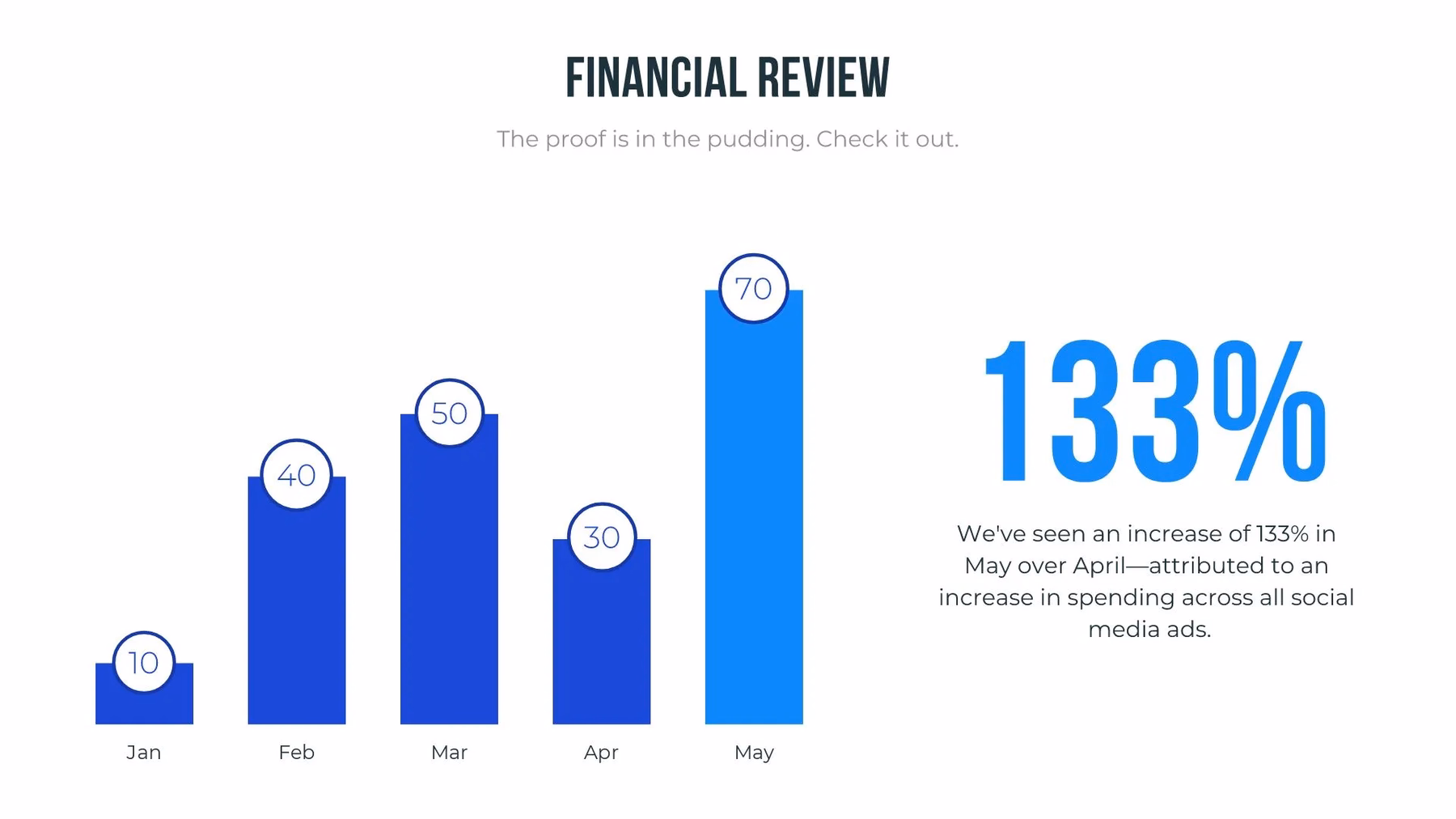
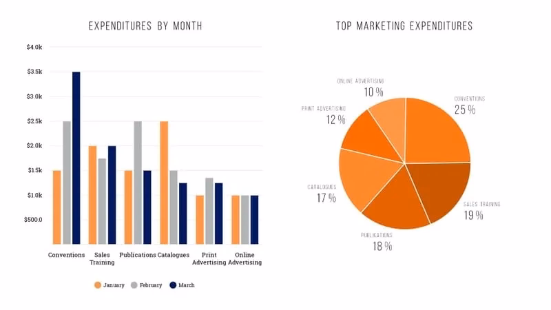
Bar graph examples with data
Our beautiful Bar Graph template in action. Here are some bar graph chart examples you can use in your next presentation.


.gif)
.gif)
